Docticing Case Study
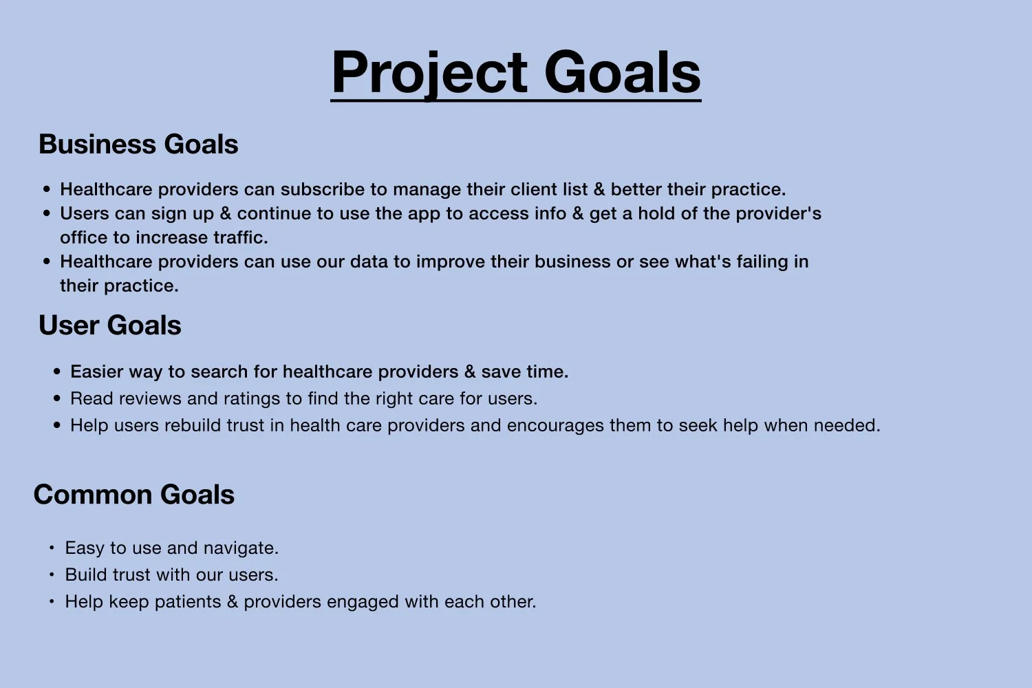
Reliable reviews for healthcare providers. Save time, book appointments and more!
My Role
Solo project for phase 1 in Designlab Bootcamp
Time Length
14 Weeks
Problem
Finding the right healthcare professionals or if you just moved to a new area how to find the right care instead of searching endlessly online.
Background
Finding a good doctor or health service is getting more complicated in America. It's becoming more frequent that you are a new patient and call the office to set up an appointment only to find out that they are not accepting new patients. Or you just moved to a new area and need to see a specialist and you're looking endlessly online trying to figure out how far the office is or their webpage hasn’t been updated and are no longer in service. With today's world and busy schedules let's cut the time on all this.
Research Goals
We want to know what people look for in a healthcare provider so that we can provide them with a safe and easy website to make those decisions.
What I found in my competitive analysis was some of these companies were deleting any negative reviews and users were starting to notice. Losing the user’s trust. Others with booking appointment features were canceling last minute and still charging the provider for using their platform.
User Interviews
I interviewed 7 participants and got some interesting answers from my questions.
Type Of Questions I Asked
What type of challenges they have faced when seeking healthcare services. Any unpleasant experiences and what type of services they expect to see in good healthcare services.
Affinity Mapping
Info obtained from affinity mapping:
Some search engines are flawed. (They don’t have updated info)
Participants noticed doctors are overbooking their appointments and causing delays in being able to schedule an appointment within reasonable time frame.
A common answer I kept seeing with my participants was they want a provider who will listen to them.
Next Step: how might we statements.
Here are some of the important statements that stood out to me during this phase:
How might we help healthcare providers want to use our services to help keep and bring in loyal patients?
How might we create an online safe space so patients could share their reviews about healthcare providers?
How might we respect HIPAA laws for both patients and healthcare providers so we can avoid any legal conflicts?
How might we help new patients select the right healthcare provider for them & their needs?
Learning
Working on site maps, user flows and task flows I learned the importance of information architecture.
For Docticing I had to decided the main flows and features that was important to work on first.
Create an account, find and book an appointment, and leave a review or rating.
Designing The Brand
I knew Branding colors for Docticing needed to be shades of blue. I noticed a lot of medical brands have blue colors, its projects a calm and secure feeling and its understandable because seeking medical attention can be scary for the patient. My logo had a heart replacing the o in Docticing because I also wanted the brand to have a caring vibe to it.
Designing
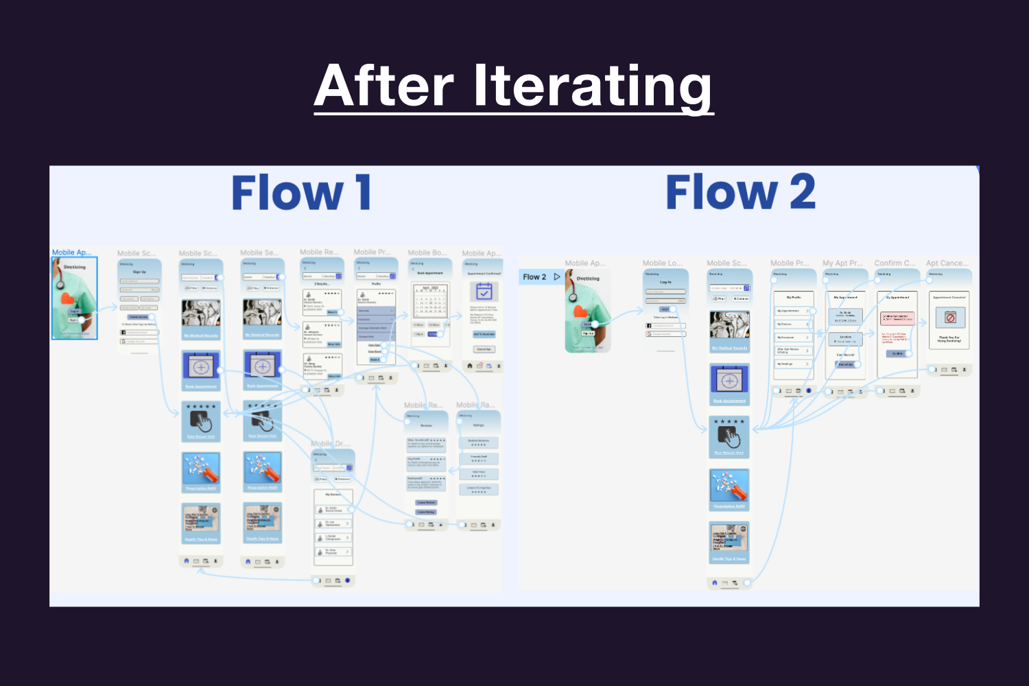
Next Up Was Prototyping, Usability Testing And Iterations.
I did an unmoderated usability test with a few participants familiar with the project and a few recruits from online that were not familiar but were also Designlab students. One of the feedbacks I got was that my prototypes still felt like wireframes. I had a feeling a lot of the miss clicks from my participants were also because my design wasn’t engaging with visual cues.
What I Improved..
I added more color. I did a gradient background. Adding more visual cues by making sure “My Medical Records” had medical images. The calendar had more highlights to what date and time was being scheduled.
Reflection
There are things I would have done differently, like my card sorting. I would have used different words. That would have had just a slight effect with my sitemap. Due to time constraints I would have modified my high-fidelity wireframes like changing my dashboard a little bit with my “Book Appointment” section. Overall I learned a lot and will take what I learned from this and make more user friendly designs that are engaging.


